Showing posts with label panpastels. Show all posts

Thursday, October 9, 2014

Trying a New Technique


Here is a picture of Frida that I chose as my  model.  I wanted to try this new technique I learned from Jeanne Oliver in the Studying Under the Masters course.

o

First you draw with charcoal and then you add gesso to make an underpainting and then you paint it. This is what I have so far.  Its a great technique, I think I will use this from now on.It really helped me see where I had gone wrong.  At first I had the hand in the wrong place so I just gessoed over it and used the charcoal to add it in the right place.  It doesn't really look like her but that is ok as I am just learning the technique and I don't like making exact replicas anyways. I am learning so much in this course.


She was painted with Golden fluid acrylics.  I made the background and table with PanPastels. She is not perfect by any measure but I sort of like her so I will move on to the next piece. Oops I just realized I never added her jewelry.  I guess I will do that at some point. As they say art is never finished.


I am linking to Paint Party Friday today. To see what other artists are doing. Check out Paint Party Friday here. If you found something of value in today's post, I'd love it if you shared it.


Have a great weekend.

Kate

Tuesday, July 29, 2014

Creating With PanPastels and Stencils.


I finished up these pages I had started when I had insomnia Sunday night.  The backgrounds were made with stencils and panpastels.  I love using them this way.  Since I learned from Carolyn Dube how to set them with a gelli plate I am ready to role.  Its so easy.  Check out her video on the process below.

Friday, July 25, 2014

Icon Portraits

So one of the exercises in Spectrum's offering on Nourish this month is all about seeing the divine within and painting an icon like portrait.


My first one didn't work that well. The gold leaf adhesive I use wasn't working and I didn't like the effect of the cardboard.


The second on in process for you. First I added clear gesso and some stablio pencil to highlight areas.


Next I used watercolor pencils and blended with a brush.


Then I added acrylic paint to the face and hair.


Lastly I added gold foil in the background.  I like this one a lot better.


This is one I tried in Panpastels, it really looks different.  I skipped the color pencil stage and it really made it look different.  This process is really fun.  It interesting painting on your own portrait, sometime it looks like you and other times it seems really different. I don't think this one looks like me at all.

Friday, April 5, 2013

Poppies, Feathers and Dominoes


I have been working in a Pan Pastel class that I took from Donna Downey. More exercises to come.  I do love these classes of hers.


This was a feather for a prompt in the sketchbook challenge I am doing.


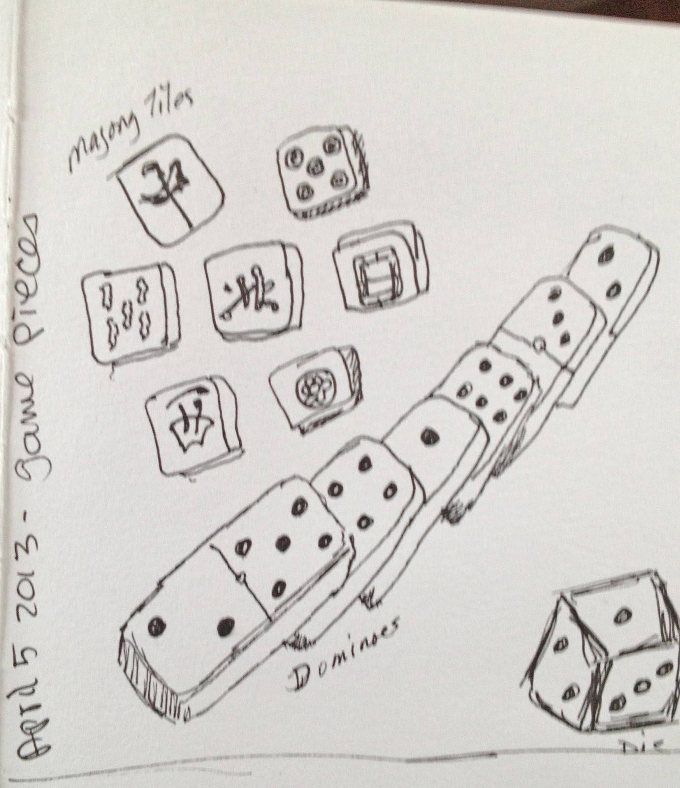
Game pieces prompt.  Not feeling to well today so this is pretty simple. Rain is now coming down it looks like the day is turning dark and dreary. Time to watch some art videos.

I am taking Julie Fan-Fei Balzer's little class on gesso. Since I have been using it for years you would think it was one I would skip. I heard she was covering spray gesso and clear gesso which are two products I bought and rarely use. I figured it was time I figured out how to use them.  I have learned a lot about gesso I didn't know. Like all the different kinds, when to use which one and how to tint.  The class is fun so far. Ok off to watch another video.

Saturday, March 2, 2013

Pastels and Collage

I got the stitches out of my hand on Wednesday and have been going to a therapist to get my hand back in shape. It has 25% of the strength of my left hand. So I have some work to do.


Meanwhile I managed to finish one of the Rose Tyler fingerless mitts.  I like the way it turned out.  Now I need to make the other one.


I am still doing exercises in the Pan Pastel classes I am taking.  This was made with a stencil and modeling paste.


This one is from the class on Poppies. These have an abstract look to them.  I have always liked poppies so I am enjoying learning how to draw and paint them.


Pam Carriker is painting a face with PanPastels in this video.


She does a really nice job.  She uses a stencil to draw the basic face and then paint with PanPastels. It looks so easy when she does it.


These two pages are from the altered book journal I have been using for some time.  The book is all about whaling.  I had removed some pages because the book is getting to big.  I use Tim Holtz tissue paper for the background and then took one of the pages I had removed and used them on this page.  This is a letter written by Laura to her husband who is a whaler, I added their pictures for emphasis.


On the facing page I added tags and ribbon and a journal space.  I will add some words about the couple on the tag. I love this tissue paper. Its so see through that it lets the color from the page come through.  You can also color on top of it. I found it at scrapbook.com.

Thursday, February 21, 2013

Coming Back to Art

ANNOUNCEMENT :  Its my birthday on Wednesday February 27th and I am having a giveaway that day only so make sure to check back on Wednesday.

I am slowly recovering use of my hand. It's easier for me to type on a touch screen so I am typing on my iPad and taking a few times to put this together.


 I tried some art with my left hand but don't really enjoy it. This bird was drawn with my left hand some of the coloring was done with my right. I found it easier to make some gelli prints so I did


This was my first round of prints.


The fun thing about making these prints is the excitement you get when you try a group of colors or stencils and are amazed how cool things look.


That is how this print came about. I put blues and purples on the plates and did another layer on one of the orange prints. I didn't know if it would look good or not but was pleasantly surprised.


These papers look amazing in person.


I may even add some more to these, maybe some metallics would be fun.

This video shows making a foam plate to us with the gelli plate. It looks easy and fun.


In this video Andy Skinner uses the gelli plate to design an entire piece, I thought it was fascinating to watch him.


If you don't have a gelli plate did you know you can make you own?  Here is a link to making your own. Or you can use a piece of tile. You can't get deep detail with tile but you can get some great prints.

Pan Pastels

I enjoy using PanPastels but have not used them as much as I'd like.  When I found out that Donna Downey was teaching classes on PanPastels I couldn't resist.


This is a page in my moleskine sketchbook I was just tooling around with color.


This is page to see how panpastels look on differently on different mediums


Here I took lots of different papers to see how they take the pastels. It was interesting to see the different absorbency indifferent papers.


I loved how this exercise was going and then I made a big mistake. I started with black gesso on one side and white on the other.  I used my birch trees 6 X 6 stencil and extended it. I think I did a good job with it.  This exercise was to include layering of colors and I was supposed to spray with workable fixative. The three previous pages I sprayed with a matte finish.  A workable fixative lets you keep adding things but keeps your original layers intact.  So yes I used the wrong fixative. I do like the look just the way it is.

Monday, November 5, 2012

A Happy Accident

I had a happy accident in the studio last week.  On day one I cleaned off my pallette on some pages in one of my journals.  First I added orange.  The next day some green and the third day some blue. When it dried on the third day I looked at it quite surprised.


I had created what looked like a map.  How cool is that.


Then I outlined all the continents and bodies of water with a fine pitt artist pen.


I love how I have all these little islands and rivers and lakes and some pretty interesting looking continents.  I think it would be fun to create a story to go with this world.


Speaking of stories I am a few days into Nanowrimo and things are going well. This page is a homage to that journey. I think every year I forget how hard this task really is.


Don't these colors look yummy. Its funny that I ordered similar colors in different mediums.


This page came about when I tried out my new Panapastel colors on it. I just drew shapes over all those luscious colors.  What fun. Its sort of like a cityscape with nothing particular in mind.

Have you had any surprises in your journal lately?

Friday, September 21, 2012

Faces 21 and Writing Too


I just realized that I never let my readers of this blog know what I am doing elsewhere on the internet. Time to remedy that. Over on Facebook and Twitter I have been listing an Art Journal Prompt every day,  and for Writers I have a daily writing practice suggestion.  Now I know that some of you are not on Facebook or Twitter so I created another option to see these prompts. At the end of the month I post the entire list on my website. I have the prompts already up for this month.  You can see them by clicking on this link for art prompts and this link for writing prompts.  Ok now back to 29 faces.

29 Faces

I have a couple more faces to share today. I continue to try all the media that I can think of to create these faces. I have seven more to go so I may have to mix it up to keep them original.


This face was made with Pan Pastel. I use pastel paper that had a blue tint to it. I have those tools with the little sponge covers that they sell with the sets so I used them.  They do work pretty great. I wasn't sure if I had the colors to do a skin tone or not.  I used white, burnt sienna and pink. This went pretty quick and was fun I used some pastel pencil for the small details. They key was to stop smering it all with my hand while I was working on it. At one point I got a sheet of paper out to cover up areas and that worked great.


This face was created using Derwent's InkTense Blocks. It was a lot like using the pencils but you really can lay down color quicker. I used gelatos oil pastels for the background.  This was done on mixed media paper which ended up buckling a lot due to the water I added. Adding absorbent ground to the paper really helps with water media.  I really like the Canson Mixed Media books for journals. I wish they made watercolor ones in the same sizes and spiral bound. I may have to try the Strathmore ones again. I bought the larger size watercolor one before but the paper wasn't all that exiting.  Perhaps I will have to start making my own again.

I am taking a break from art to process some peaches today, maybe I should paint them first.  The colors are so pretty.

WRITING WISDOM

I kind of spaced my writing post this week so I will add it here. I gave the writing talk at my writers group so I was spending most of my week on that. I did find some great resources on the web from fellow writer Daniel. There is a series on structure that is so good. Its a series of videos by Dan Wells. After that I found a series of lectures by fantasy writer Brandon Sanderson that is good too. I don't know why I never thought of You Tube as a source for writing wisdom. I think I will be watching a few videos for awhile.  Wisdom is power. If you're a writer check these out they are great.

Sunday, May 2, 2010

Making Art


I was reading Kim's blog and saw this message so I took her advice and did my own page and another too. The idea actually came from Connie at Dirty Foot Prints Studio. Sometimes to make art you have to shut everything else off. 


I had done this background a long time ago. It was so rich that I did not know how to use it.  Then I found this image in the right colors and added some panpastel for shading and it came to life

Artshine Sketchbook


 The theme of this book is Love and all its forms.  Here I made fabric paper by sewing strips of fabric to watercolor paper and then added an image and trim.  I see this as mother daughter love and also love of reading.


Here I use my favorite picture of Sarah and I and a few words.  The background is done with Panpastels and some stamping.


I needed to make something for my church's auction so I took some stitched paper I had made previously and made postcards. These are really fun to make